
Your Classic Funnel
How on earth has the image of a funnel become the prevailing symbol of sales process and sales forecasting the world over?
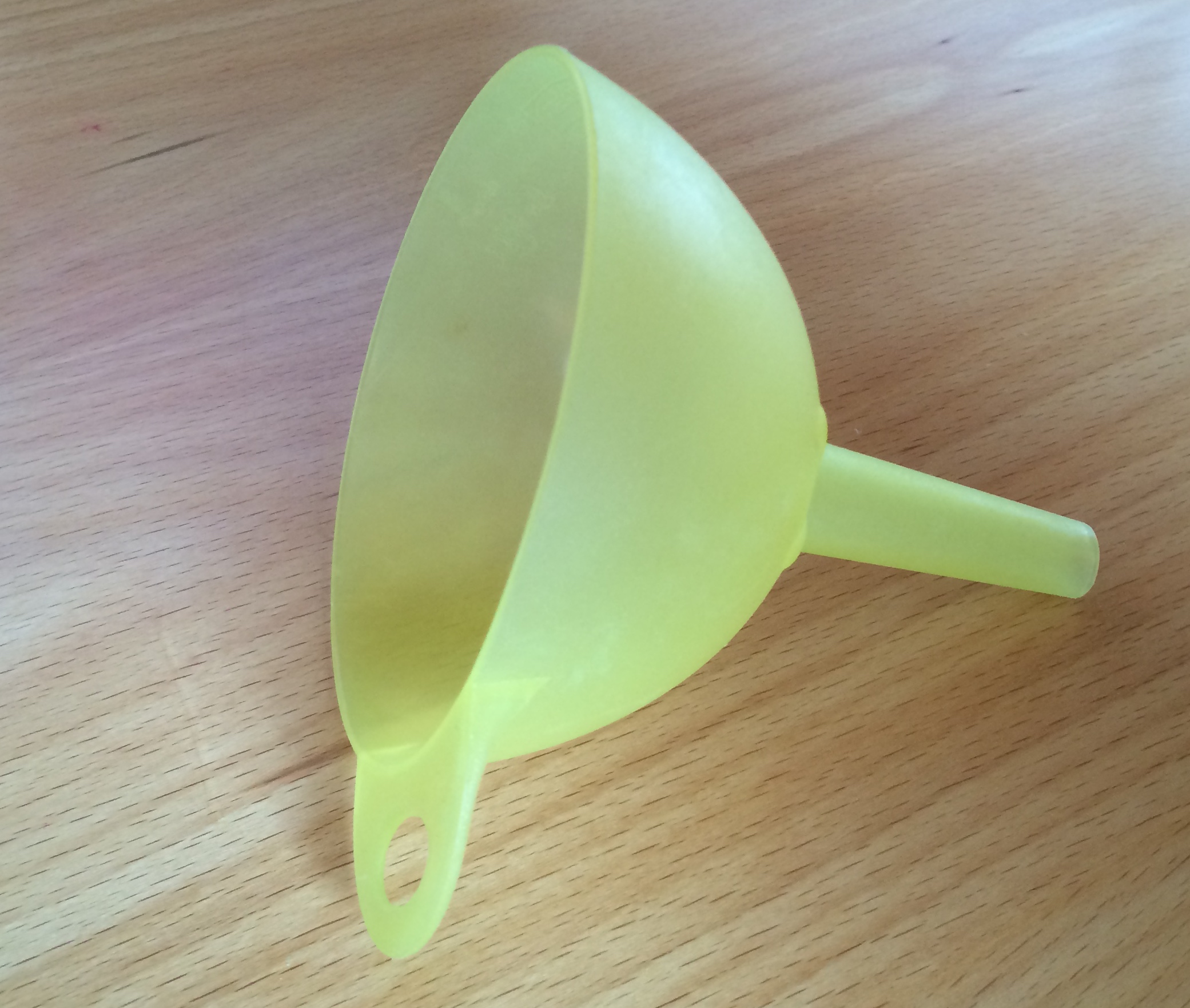
Funnels come in all different shapes and sizes. The one I’m looking at in this post is your typical kitchen funnel, with a bulbous part that holds the liquid and then a long narrow shoot below it. Your classic sales funnel graphic, however, is a tall, narrow V shape with lines across it, within which lines are the sums of sales opportunities for each specific sales sales stage at that specific moment in time. The early stage opportunities are at the top, and the later stages are towards the bottom. The later stage opportunities are less plentiful – would that it were the other way around! – hence the unmistakable V-shape.
The differences don’t end there, however. Firstly, the sales funnel image is usually 2-dimensional, whereas you could really do with something in 3-D. Furthermore, when you think of a real funnel, all the liquid falls through the bottom, whereas in the sales funnel only the won deals fall through to be processed. Where do the non-deals, the lost deals and the qualified-out deals go? Do they evaporate from the funnel? And wouldn’t it be great if we could get a sense, over time, of how and when deals are dropping out or dropping down from one stage to the next, more advanced stage? And, while we’re at it, some sense of where the deals originated would be handy too.
No, the funnel is a lousy symbol, and so is the ‘hopper’. The ‘pipeline’ is no better.We need an image that acknowledges both the linear nature of a sales process but also the cyclical nature of continually qualifying a sales opportunity. Something that loses progressively smaller volumes as it goes along until only the good stuff comes out. Leave that one with me…unless you’ve any suggestions?
